In this website redesign case study, I'll examine my teams work on a business's website. We'll review the goals, design decisions, and how they impacted the site's conversion rates.
Overview
Simple design changes can produce outsized business outcomes. A Microsoft case study featured in Harvard Business Review demonstrated how minor UX adjustments translated into millions in incremental revenue. This project applied the same principle at scale, optimizing a website with hundreds of local landing pages to identify the design patterns that most effectively drove phone-call conversions.
There is no universal website design that works for every brand. Performance depends on audience intent, device context, and clarity of action. What succeeds for one business can fail for another. Our goal was to determine, through disciplined experimentation, what worked best for this specific audience.
Table of Contents
Results Summary
After six months of structured A/B testing and iterative design improvements:
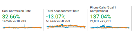
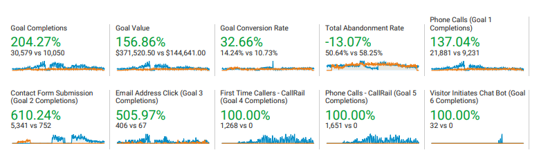
Sitewide conversion rate increased from 5.03% to 14.24%
Organic and paid sessions increased 122%, from ~90,000 to 207,000
Phone calls increased 137% year over year
12,650 incremental calls generated
Estimated incremental revenue: $1.25M
PPC landing pages achieved up to 26.06% conversion rates
Testing Methodology
We conducted continuous experimentation across multiple platforms, including Google Optimize and Unbounce, testing incremental changes rather than wholesale redesigns. Key variables included:
Headlines and title length
CTA wording and button behavior
Mobile navigation and layout
Trust elements such as reviews
Font size and visual hierarchy
Breadcrumb visibility
Footer and floating call buttons
Mobile responsiveness and viewport optimization
Each change was validated with statistical confidence before rollout.
Key Findings
1. Headlines Matter More Than Expected
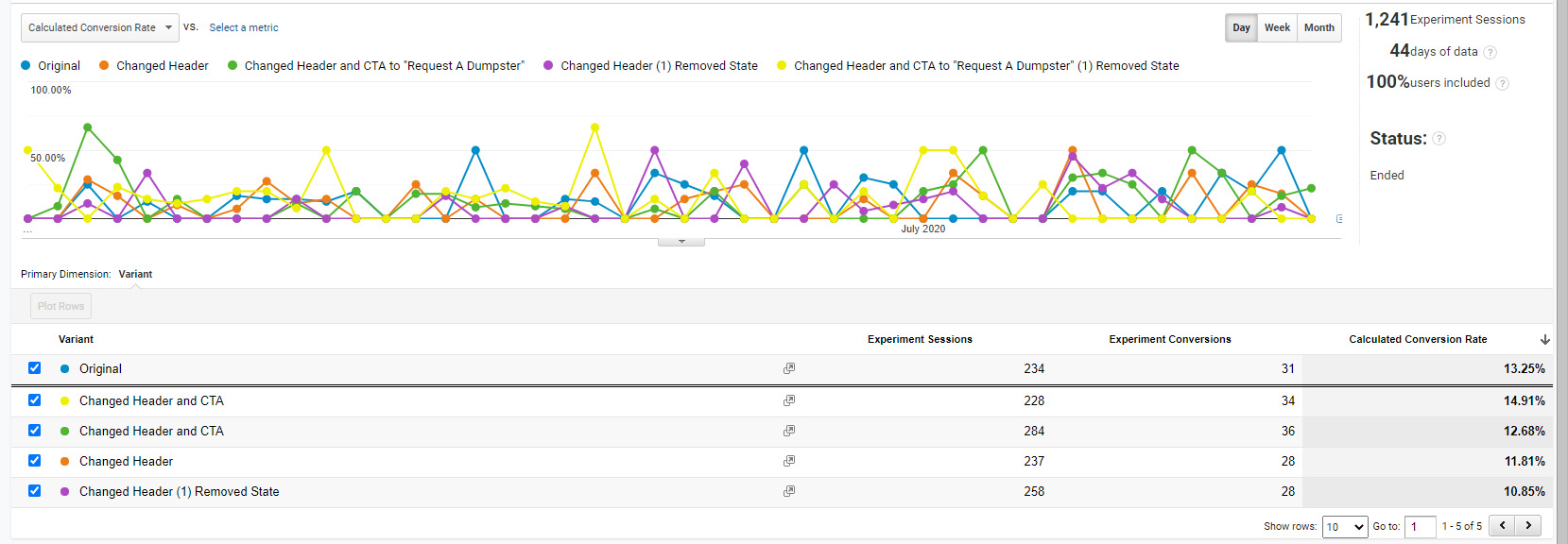
Headline testing produced some of the most dramatic results. On a Las Vegas location page, simply shortening the headline by removing two words doubled the conversion rate from 5.03% to 11.19%. A parallel test on the Kansas City page confirmed the result, reaching 11.01%.
Figure 1: Kansas City location page tests, one of many tests in Google Optimize.Figure 2: Las Vegas location page tests.
Google Optimize reported 95% confidence that the shorter headline outperformed the longer version. Further CTA refinements increased conversions to 14.9%.
In practical terms, if this test were repeated 100 times, the shorter headline would outperform the longer one approximately 95 times.
2. Click-to-Call Beats “Request a Call”
Lead quality analysis revealed a critical insight:
“Request a call” leads closed at ~10%
Direct phone calls closed at ~25%
By converting all primary CTAs to click-to-call actions, we removed friction and aligned the design with user intent. This single change materially increased both call volume and revenue.
3. Mobile Optimization Was the Largest Lever
Mobile users were far more likely to convert when the experience was explicitly designed for phone calls.
This aligns with Google’s research on the “messy middle” of the buyer journey, where reviews are among the most influential decision factors.
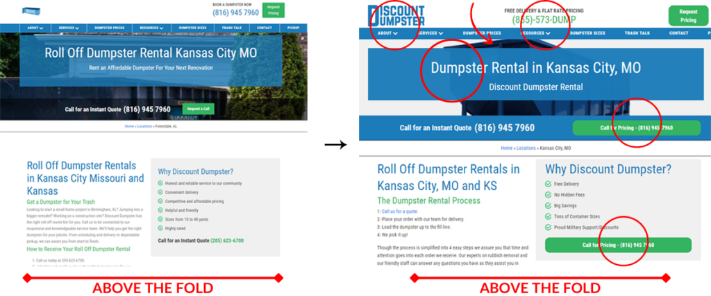
Website Redesign Case study above the fold before and after
5. Content Length Matters Less Than Structure
Longer pages did not outperform shorter ones by default. What mattered was:
Clear above-the-fold messaging
Mobile-friendly layouts
Prominent CTAs
Immediate trust cues
Users self-selected into deeper content as needed. Strong structure outperformed sheer volume.
Performance & Technical Optimization
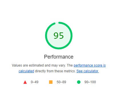
The final phase focused on site performance and Core Web Vitals. After optimizing scripts, layouts, and load behavior:
95/100 Lighthouse ScoresPerfect Core Web Vtials
95–100 Lighthouse scores
Perfect Core Web Vitals
Speed improvements are not cosmetic. Industry benchmarks show measurable revenue impact from even sub-second gains, reinforcing the business case for UX and performance investment.
These minor changes influenced the probability that someone would make a phone call.
On mobile, we A/B tested a floating footer element to the bottom of the page with an easy-to-click button making it even easier for users to call us.
Footer elements floating bar
Combined Impact
After deploying all changes across the live site and pairing them with refined PPC strategy:
26.06% average nationwide PPC conversion rate
5,076 clicks generated 1,323 phone calls
~94% reduction in wasted PPC spend through keyword refinement and SKAG structure
The most influential factor was consistently the above-the-fold experience, where users decide in seconds whether to act or leave.u.
Conclusion
This case study demonstrates that conversion growth does not require radical redesigns or increased ad spend. It requires disciplined testing, clear user intent alignment, and respect for how people actually behave online.
Through targeted design changes, mobile-first optimization, and performance improvements, we achieved:
14.24% average sitewide conversion rate
26% conversion rate for paid traffic
137% increase in call volume
The takeaway is simple, optimization works best when design decisions are treated as hypotheses, not opinions.
If you had told me a couple of years ago that I could type "a cyberpunk hedgehog making a latte" and get a photorealistic 4K video back in seconds, I would have laughed. But here we are in 2026, and AI video generation isn't just a novelty anymore, it's a massive part of my daily workflow.
This guide leverages my experience to break down how to write, structure, and publish a document that earns trust rather than just demanding attention.
Depending on who you ask, there are anywhere from five to twenty "essential" rules out there. But in my experience, there are really only a dozen “laws” of visual design that matter across every medium. Here’s a guide I’ve created with the elements I find to be the most important, no matter your platform.
I love WordPress for its customizations. Styling code snippets enhances user perceptions. Copy and paste the code below to style your WordPress code blocks.