Depending on who you ask, there are anywhere from five to twenty "essential" rules out there. But in my experience, there are really only a dozen “laws” of visual design that matter across every medium. Here’s a guide I’ve created with the elements I find to be the most important, no matter your platform.
I used to think creativity was just another word for chaos.
When I graduated from The Art Institute of Colorado in 2007, I had this romantic idea that structure was the enemy of creativity and that real art had to be completely unconstrained. But that illusion shattered the moment I started cutting feature documentaries. You try managing a massive timeline for a project like Dalai Lama: Scientist without a rigid system and you learn pretty fast that "wild" is just a nice word for "unusable."
That was the turning point where I realized effective design isn't just about making things look good, design is about making information accessible.
Fast forward twenty years, and that truth holds up whether I’m editing a film, building a site for a local nonprofit, or formatting a white paper. Design is the set of instructions we give the audience so they know how to feel and where to look.
Table of Contents
Purpose of This Guide
Before we get into the weeds of the specific principles, I want to be clear about why I’m cataloging the principles of design in the first place.
The fundamentals of visual communication don’t change, whether you’re designing the UI/UX of a website or a nature photographer shooting on film, the foundation is there. I’m here to try to illustrate these fundamentals from the aspects of design I’ve observed in my career.
What I want you to see is these concepts as possibilities, not limitations. A rule may exist to be followed, but a principle exists to be understood. Once you truly understand the "why" behind a principle, you earn the right to break it for creative effect.
Ultimately, these examples are meant to show you what you can do and not just what you must do.
The Core Principles of Design
Here are the twelve most common principles I follow in my design work, with dos and don’ts as well as some of my favorite real world examples of each in motion. I should note, “don’t designs” doesn’t mean they are fundamentally bad designs, but in these examples, they’re meant only to show the concept of breaking a technique.
1. Contrast
Do
Don’t
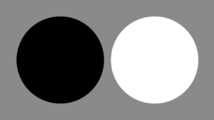
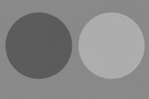
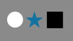
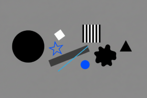
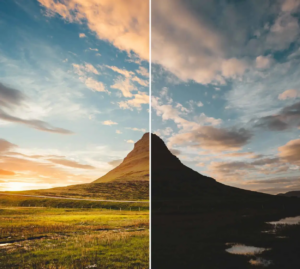
Contrast is simply the difference between two adjacent elements. While most people think of black and white, I often think of it in terms of "loud vs. quiet" or "stillness vs. chaos." It’s about creating a noticeable distinction that grabs the senses.
Role: It creates immediate impact and dictates readability. Without contrast, everything bleeds together into a gray noise.
Core Function: Distinction
Real-World Applications:
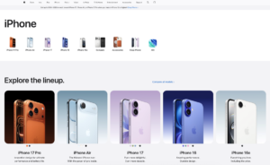
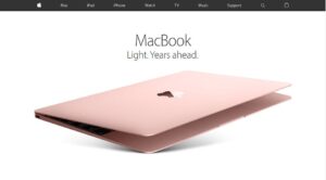
Web Design: Using white text on a deep black background for a headline to ensure it pops. Apple perfectly uses this technique on almost every page on their website.
Video Editing: Cutting from a chaotic protest scene directly to a silent, slow-motion shot. The ending of 2019’s "Joker" shows the power of this effect in action.
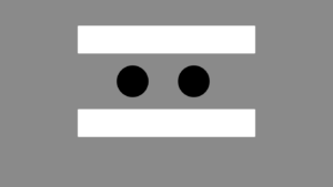
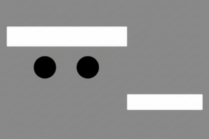
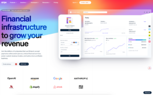
2. Balance
Do
Don’t
Every element in a design, whether it’s a block of text or a person in a frame, has "visual weight." Balance is how we distribute that weight so the composition doesn't feel like it's tipping over.
Role: It provides stability and structure, determining whether a layout feels formal or dynamic.
Core Function: Stability
Real-World Applications:
Symmetrical: A menu with everything aligned in the center, like this design by Minted.
Asymmetrical: A website design that prioritizes images, leaving important text to ⅓ of the screen. Stripe for example highlights photos of their product, pulling the eye.
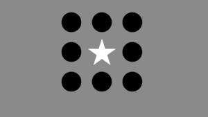
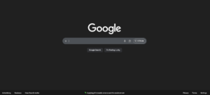
3. Emphasis
Do
Don’t
Emphasis is about creating a focal point. Good design dictates that not everything can be important. If everything yells, nothing is heard. Sometimes, emphasis is achieved by what you don't highlight.
Role: It prevents the viewer from being overwhelmed by establishing a clear starting point.
Core Function: Focal Point
Real-World Applications
UI Design: By shrinking secondary information, you emphasize the main content by default. Google is the go-to example of mastering this design technique.
Cinematography: Using a shallow depth of field to blur the background, forcing the audience to focus solely on the subject's eyes. "Oppenheimer" is a recent film that took this style to a whole new level, as you can see in the trailer.
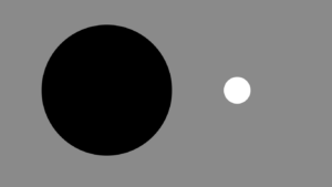
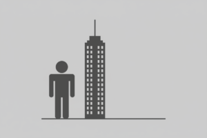
4. Proportion
Do
Don’t
Proportion creates relationships between elements based on their size. It tells us how one object relates to another and to the whole composition.
Role: It signals importance through scale—we instinctively assume bigger things matter more.
Core Function: Relative Size
Real-World Applications:
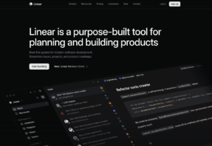
Typography: A headline that is set to 60pt font versus body copy set to 12pt, instantly signaling which is the summary. Linear keeps the headlines clean on their website with this technique.
Photography: Placing a human figure next to a mountain in a wide shot to convey the sheer scale of the landscape such as this photo by Chris Burkards.
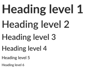
5. Hierarchy
Do
Don’t
Hierarchy is the structural ordering of information to ensure comprehension. It guides the user through the content in the order you intend.
Role: It facilitates comprehension and scanning, guiding the user from the most critical info to the details.
Core Function: Organization
Real-World Applications:
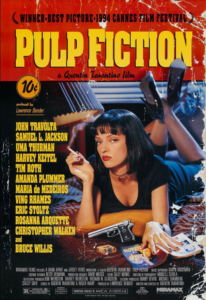
Print: A movie poster where the Title is huge, the Director is 2nd, and the Actors are after such as 1994’s Pulp Fiction.
Web: A blog post structure using H1 for the title, H2 for main sections, and bold text for key takeaways. Indeed wrote a great article on this with examples.
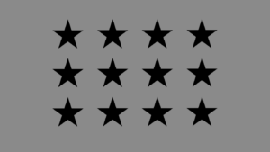
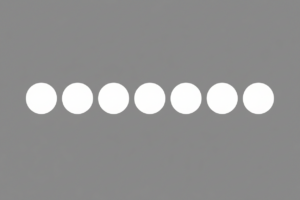
6. Repetition
Do
Don’t
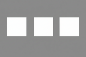
Repetition involves using the same visual element multiple times throughout a design.
Role: It builds brand identity and familiarity. It teaches the user the "rules" of your specific design universe.
Core Function: Consistency
Real-World Applications:
Branding: By using the exact same hex code of pink in stores, the website, video production elements, and more T-Mobile practically owns the color.
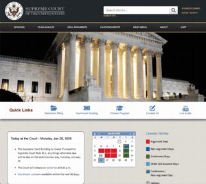
Navigation: Keeping the menu bar in the exact same spot on every single page of a website so the user doesn't have to relearn how to navigate. Visitors of the Supreme Court website are able to navigate menus easily.
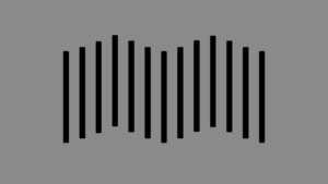
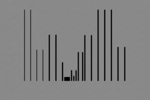
7. Rhythm
Do
Don’t
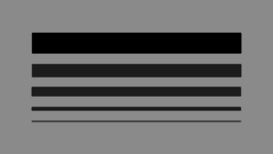
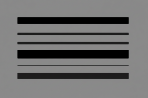
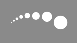
Just as music has a beat, design has a flow. Rhythm is created by the spacing and repetition of elements to create a sense of movement or pacing.
Role: It moves the viewer through the content at a specific speed—either exciting and fast, or slow and deliberate.
Core Function: Pacing
Real-World Applications:
Social Media: A grid of Instagram posts that alternates between a photo and a quote graphic, creating a checkerboard rhythm. Shopify’s Instagram profile commonly uses this technique when posting.
Film Editing: A sequence where cuts happen exactly on the snare drum hits of the soundtrack. Apple's "Don't Blink" is a perfect example of this technique in action.
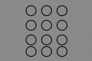
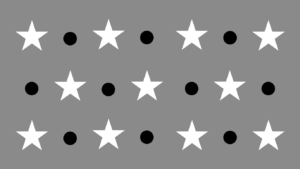
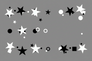
8. Pattern
Do
Don’t
When repetition becomes predictable and covers a surface, it becomes a pattern.
Role: It simplifies complex information by providing recognizable visual shortcuts.
Core Function: Texture/Predictability
Real-World Applications:
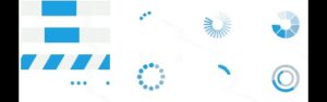
Software: Using a "striped" pattern on a progress bar to indicate that data is processing like these WinForms WaitingBars created by Telerik.
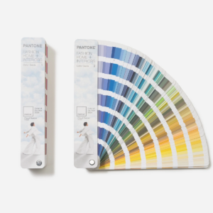
Packaging: A recurring motif that makes the product instantly recognizable. Pantone’s simple rectangles are an iconic example of pattern, recognizable no matter the color.
9. White Space (Negative Space)
Do
Don’t
White space is not merely empty space, it is an active design element. It is the breathing room that prevents a design from becoming suffocating.
Role: It prevents cognitive overload and gives the design room to breathe, increasing the perceived value of the content.
Core Function: Focus/Clarity
Real-World Applications:
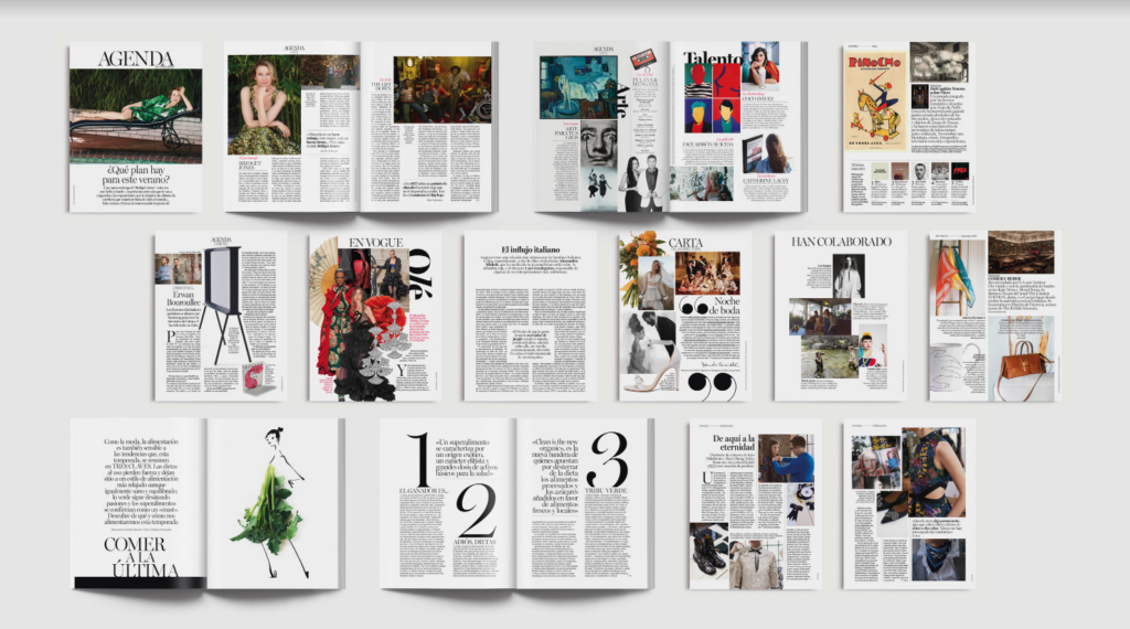
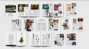
Editorial: A magazine spread with wide margins and ample space between lines of text to make reading easier on the eyes. Vogue Spain is known for their exceptionable use of white space in their layouts.
Luxury Marketing: White space highlighting a product in the center can invoke emotions of exclusivity, which Apple has long embraced.
10. Movement
Do
Don’t
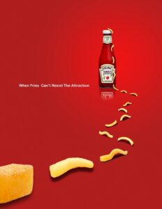
Movement refers to the path the viewer’s eye takes through the design.
Role: It ensures the viewer sees the information in the right order and doesn't get stuck in a "dead zone."
Core Function: Direction
Real-World Applications:
Advertising: Even in stationary designs like this Heinz ad, movement can be created by leading the eye of the viewer across the page.
Web Design: A fun to use parallax scrolling effect that encourages the user to keep scrolling through the page. Tiny Pod has mastered this effect perfectly.
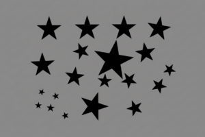
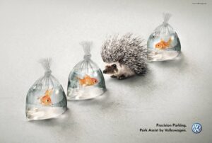
11. Variety
Do
Don’t
Variety is the introduction of contrasting elements to break up monotony. While repetition provides consistency, variety creates interest.
Role: It maintains interest and engagement, waking the viewer up when things get too predictable.
Core Function: Interest
Real-World Applications:
Layout: By creating a pattern and then breaking it, you create variety. VW used this in their “Hedgehog and Fish” ad campaign.
Unity is the state where all elements look like they belong together.
Role: It creates a sense of professional cohesion. When a design has unity, the viewer trusts it because it feels "finished."
Core Function: Cohesion
Real-World Applications:
Color Grading: Applying a specific LUT (Look Up Table) to an entire film so that the sunny outdoor shots match the mood of the dark indoor shots. Websites like Shutterstock have thousands to choose from.
App Design: Ensuring that the "rounded corners" on buttons match the "rounded corners" on image frames throughout the app. Duolingo is a learning app that uses rounded corners across its app for a unified look.
Visualization: The Principles at a Glance
Principle
Core Function
Real-World Application
Contrast
Distinction
Dark text on a light background for readability.
Balance
Stability
A symmetrical landing page for a law firm.
Emphasis
Focal Point
A "Buy Now" button in a contrasting color.
Proportion
Relative Size
A headline significantly larger than body text.
Hierarchy
Organization
Large H1 titles vs. small body copy.
Repetition
Consistency
Using the same logo placement on every slide.
Rhythm
Pacing
A gallery of images spaced evenly apart.
Pattern
Texture
A recurring background motif on packaging.
White Space
Focus
Generous margins around a luxury product photo.
Movement
Direction
An arrow pointing toward a form field.
Variety
Interest
Mixing photography with illustration.
Unity
Cohesion
Consistent color palette across an app.
Other Important Elements of Design
Beyond the core principles, there are specific tools in my kit that play a critical role in execution. These are the subtle details that separate a polished professional from a novice.
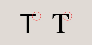
Typography
Typography is more than just picking a font, it is picking the tone your work will be heard in. In my projects, I treat choosing typography like casting a voice actor.
Tone: A serif font (like Times New Roman) speaks with the authority and tradition of a narrator. A rounded sans-serif speaks with the friendliness of a peer.
Readability: If the audience has to squint to read your subtitles or your body copy, you’ve broken the immersion.
Range: Not all fonts are created equal. Some can be applied in multiple languages, while others may be missing critical symbols or accents. It’s important to make sure a font includes all the characters you will require for your project.
Legality: Many fonts must be licensed for commercial use. Sometimes availability and cost factor into your design choices.
Color
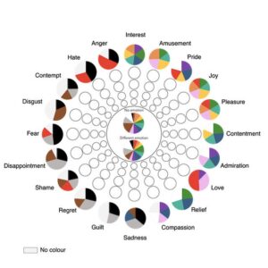
Color is immediate emotional weight. In the editing bay, we call this "grading," but the rules apply everywhere.
Emotions presented as the wheel in our study (Jonauskaite et al, 2020) and the most common associations with colors published in Psychology Today.
Emotion: I use warm tones (oranges, yellows) to evoke nostalgia or comfort, and cool tones (blues) to suggest isolation or technology.
Accessibility: This isn't just about aesthetics, it's about inclusion. Sufficient contrast ensures that users with visual impairments can actually receive your message and adhere to WCAG or similar standards.
Cognitive Load: I use color coding to reduce brain work. When video editing for example, color coding sections of clips can help make the process more streamlined.
Gestalt Principles
Originating from psychology, Gestalt principles explain how humans naturally group visual information. It’s the reason a montage works, the brain connects separate clips into a single story.
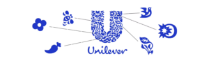
Unilever uses Gestalt principles in their logo with smaller shapes creating one.
Proximity: Objects close together are perceived as a group.
Similarity: Objects that look alike (same shape or color) are perceived as related.
Closure: The brain fills in the gaps to see a complete image (like reading a word even if a letter is missing).
Grid and Alignment
Grids are the invisible skeletons of design. They ensure structural organization and consistency. In video, we use "title safe" and "action safe" guides and in web design, we use column grids. A strong grid allows me to place elements quickly and confidently, knowing they will feel "right" because they align with an underlying mathematical structure.
Framing controls focus and context. By cropping an image tightly, you force the viewer to look at a specific detail (emphasis). By stepping back, you provide context. Similarly, you can frame context with wording, such as saying, “90% chance of success” vs “10% risk of complications.”
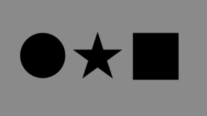
Shapes carry symbolic meaning. Squares can suggest stability and logic while circles might suggest community and protection. When designing a logo, for example, it’s important to consider the context behind the shape(s) you chose and what underlying meaning they may tie to your design.
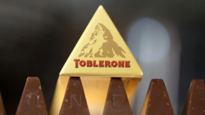
Toblerone uses the shape of their chocolates to evoke the feeling of being on an adventure in the mountains.
Tips for Implementing the Principles of Design
Knowing the definitions is step one but applying them is an ongoing practice. Here is how I operationalize these concepts, whether I’m at my desk or on a shoot:
Don't make me guess (Contrast): If you want a user to click a button, ensure it is the most contrasting element on the page. It should be the "loudest" thing on the page.
Guide the eye (Hierarchy): If a sub-headline feels as important as the main headline, shrink it. The difference should be obvious, not subtle.
Find the beat (Rhythm): Limit your font choices to two or three. Limit your color palette. Try to find creative ways to work within limitations.
Let it breathe (White Space): When in doubt, add more space. If a layout feels crowded, it usually means there is a lack of negative space separating the elements.
Break the grid (Variety): If a page feels stagnant, break the pattern with a distinct shape or an off-center image to pull the eye downward.
Build the universe (Unity): Ensure your icons and graphics share a similar visual style to maintain unity. It makes the project feel more authoritative.
Diagnosing Design Issues
When a design feels "off", I run it through a diagnostic check, just like troubleshooting a corrupt render. I’ll ask questions about the elements such as:
Is the Contrast too low? (Is it muddy?)
Is the Hierarchy flat? (Does everything look the same size?)
Is the Balance lopsided? (Does it feel heavy on one side?)
Usually, the problem can be traced back to the violation of one of the twelve core principles.
Using Multiple Principles Together
The most effective designs do not rely on a single principle, they layer and combine them. Consider a well-designed "Hero Section" on a website:
It uses Emphasis (via Contrast) to highlight the headline.
It uses Balance to position the text against the image.
It uses Hierarchy to tell you to read the Headline first, the subtext second, and the button third.
It uses White Space to frame the content so it doesn't feel cramped.
Design principles are not rigid laws to restrict you. Whether you are a new student or an experienced art director, these concepts are foundations to build your creative work upon. By applying them with intention you can help your audience understand your core message and reach your goals as a designer.
If you had told me a couple of years ago that I could type "a cyberpunk hedgehog making a latte" and get a photorealistic 4K video back in seconds, I would have laughed. But here we are in 2026, and AI video generation isn't just a novelty anymore, it's a massive part of my daily workflow.
This guide leverages my experience to break down how to write, structure, and publish a document that earns trust rather than just demanding attention.
Depending on who you ask, there are anywhere from five to twenty "essential" rules out there. But in my experience, there are really only a dozen “laws” of visual design that matter across every medium. Here’s a guide I’ve created with the elements I find to be the most important, no matter your platform.
I love WordPress for its customizations. Styling code snippets enhances user perceptions. Copy and paste the code below to style your WordPress code blocks.


